The last few weeks have been very busy, so I hadn't had much time for printing until this weekend. I received my most recent order of envelopes earlier this week and I wanted to get printing a.s.a.p. I have the Creative Finds craft fair/art show coming up on December 1st, and since I've sold most of my entire inventory since my last show (and online at my Etsy store), I don't have a lot of product hanging around. I've got a lot of ground to cover between now and December 1st, but I'll "git'er done".
The prints above and below are of a berry stem graphic that I used in my studio's New Year's card for 2007. I decided to re-use the graphic for some notecards for my own personal use this year. I love the bright red ink for this design, and there is a nice bite in the paper from this one too.
In case you are not very familiar with letterpress, there is an ongoing and slightly heated debate taking place between those who seek an impression with their prints, and those who think impression is a next-to-cardinal sin. Today, the market demands impression - and in my opinion, the impression, or tactile nature of letterpress is what sets letterpress apart from other forms of printing and differentiates letterpress from plain old offset or the kinds of results you would get from your little desktop laser printer. But, in reality, if you are printing properly, you shouldn't get much of an impression (a.k.a. a "kiss" impression - not a bite). In fact, when using metal type, forcing a deep impression will ruin your type over time.
I see both sides of the argument - I respect the traditions of letterpress printing and realize there is more to this fine printing skill than squeezing paper so hard that you see the print through the backside of the paper. On the other hand, people want to touch and feel the results of your labor - want something different - and as a service provider, one needs to "give the people what they want". Also, for modern letterpress printers using photopolymer - there isn't the same worry about wear and tear from impression as there is for metal type.
So is there a happy medium? Check out the debate online at Briarpress. What do you think?


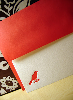
The notecard below is another reuse of an old favorite - the bird. My bird design was a big hit at my last show, and in my Etsy store, so I'm getting more ready to sell at the upcoming show.


This week I will be ordering my plates for my holiday designs from Boxcar in New York. I should receive the plates within a couple of days. I am very excited to get started on these designs and should have them up in my Etsy store sometime in early November. The envelopes are waiting for their card mates to match up with them!
At the studio we have three website development projects, 5 brochure projects, a PR project, a photo shoot, a logo, and a corporate newsletter project all to start and finish before Christmas - so I'll have to do my printing in the wee hours of the night. Lucky me!
Happy letterpressing!


LOVE the red! Can't wait to see all the new designs you'll be printing (late at night!).
ReplyDeleteI agree with you on the big debate. The target market has changed from what it used to be, and the final product has to reflect this. I think a happy medium between no impression and an impression so heavy that it prints the other side is the best aim.
Right this very minute I am printing up a big order of Christmas tags and going through this same dilemma...do I print on my Adana, and get a crisper finish but no impression or on my proof press and get the impression but slightly uneven ink (and my inks are also causing me nightmares, that's another story...)
ReplyDeleteI am going the way of light impression, as that is so far removed from people's experience of digi/PC printing that to be able to run your fingers over it is a novelty. Am so glad I found your blog in my great Google hunt. :)