Showing posts with label LETTERPRESS VANCOUVER. Show all posts

Thursday, May 5, 2016


Hello Letterpress Lovers! We've finally moved our blog over to our updated website, and I hope you'll join us and follow along at:


Please update your Feedly, Inoreader, and other blog reading apps and software so you won't miss a post!

While you're there, check out our updated and (almost completed) website. There is still a lot of work to do and additions to make, but I hope you enjoy the new site which includes our own online shop (with more products coming soon) so you can buy your stationery products directly from us!

To celebrate our new website, we'll have a letterpress giveaway coming very soon! Don't miss out!

See you on the new site!

Tuesday, December 22, 2015

Invitations for a Summer Winery Wedding in Penticton


It's almost the New Year, and here I am getting caught up on posting summer 2015 wedding invitation photos! I hope everyone is enjoying the last few (busy) days before Christmas. Are you done your shopping? I'm this close to being done, and am dreading a final (please God) trip to the mall to finish up. On a positive note, I've managed to take my kids skating this morning, bake some holiday treats with them, and get a bit of work and present wrapping done. #Winning.

So...back to summer weddings!

This custom letterpress wedding stationery suite was designed and letterpress printed in-house for White Rock couple Samantha and Daniel. The couple was married at the Painted Rock Estate Winery in Penticton - a very special venue for the foodie and wine aficionado bride and groom. Their wedding would include reserve and vintage wines expertly paired with each appetizer and meal course, as well as locally sourced and prepared dishes to be served on the vineyard.

I've never been to the Painted Rock, but doesn't it look beautiful? Vineyard photos © and courtesy of the Painted Rock Estate Winery.


Our clients were seeking wedding stationery that married clean, crisp and modern styling (much like their venue), and referenced the vineyard in an abstract way (without being too cute). The bride and groom also wanted the stationery to use only grey ink and a blind letterpress impression (letterpress printing with no ink) to keep the finish simple and to focus on the tactile impression provided uniquely by letterpress printing. The pieces were printed on our thickest 220 lb. Strathmore Pure Cotton cover to provide the extra weight and sturdiness that only a thicker stock can offer.

We created the circle pattern that appears on all stationery pieces by brush painting the circles with Japanese sumi ink. The pattern, suggestive of grapes, is simple and organic, and reminiscent of the Painted Rock Estate Winery's logo. Once the pattern was complete, we scanned and digitized the artwork so that it could be transferred to magnesium printing plate and printed on the press.

Vineyard photo © Adrian Photographers and via The Painted Rock Estate Winery.


In all, we designed and printed the invitation, outer envelope, RSVP, RSVP envelope, BBQ event invitation, accommodations card, oversize schedule of events signage, oversize seating chart signage, and coordinating place cards where the guests' names were written and a meal selection circled (to assist catering staff with delivery of plated entrées).


With the exception of the oversize signage (schedule of events and seating chart), the entire wedding invitation suite was printed by hand on our studio's 104-year old antique cast-iron Chandler & Price printing press. We do not farm out our printing or finishing work and pride ourselves on using the highest quality materials and experienced craftsmanship to create one-of-a-kind stationery pieces for our bridal clients.


Are you getting married in 2016? We are already booking stationery clients for next year, so please contact us early to reserve your space in line for press time!

Thursday, June 4, 2015

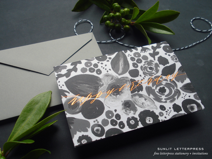
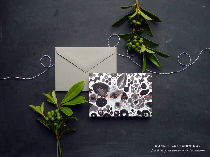
Copper Foil Happy Birthday Cards


I just love foil – don't you? There is something so special about gold, copper or silver foil against a nice piece of thick card stock. Foil printing is such a hot trend these days, and we thought it might be nice to mix it up with some of our other favorite trends (delicate calligraphy and a folksy floral art pattern). The background floral pattern was digitized from an acrylic painting I did earlier this year in black, white, and shades of grey (not 50 shades of grey...but close). The "happy birthday" lettering was printed in a copper foil and extends to the edges of the card.  You can buy these foil birthday cards in sets of 4 with envelopes in our Etsy shop.

The plants – well, those are from a bush outside our studio. I can't take any credit for them since they were here before we moved in. I love the little berries; although they do cause me a lot of grief, since I am constantly shooing my children away from them (they think they are blueberries), and I have just assumed they are poisonous. If you know what they are, please let me know :)

Tuesday, May 5, 2015

New Letterpress Greeting Cards | Etsy


Above are just a few photos of some of the new cards featured in our Etsy shop. The Joy cards are brand new, and I designed them with the intention that they would be sent to congratulate say a friend or loved one on a big life event, or letting them know the joy they bring into your life. The possibilities are really endless with this card, and it's a good one to have on hand for weddings, births, graduations, showers, and so on.

The Oh Baby! card is an oldie, but a goodie! We used to print them with lavender and blue ink against the grey baby elephant, but clients had asked us for a neutral option and so we went with a warm beige here. Sometimes unisex is the way to go with baby cards – especially when the gender of the baby is unknown!

Our Something Old, Something New card is also an oldie, just in a grey ink this time instead of blue. Again, the light grey is a nice neutral and against the beautiful soft white cotton stock has almost an aged kind of feel to it, like a family heirloom.

You can find these cards for purchase in our Etsy shop. Enjoy!

Tuesday, November 18, 2014

Sunlit Letterpress Wins Best Wedding Invitation from Canadian Wedding Industry Awards


We are excited, proud and honoured to accept the 2014 Canadian Wedding Industry Award's Best Wedding Invitation Award for the BC Region! Thank you very much to all the judges (how exciting to know that Randy Fenoli [Say Yes to the Dress], Ellen Black {Lehr + Black], Marcy Blum [Marcy Blum & Associates], Rebecca Grinnals [Engaging Concepts], Laura Gutkin [Etsy Canada] and Francis Guindon [Maison Birks] were judging something we created!) and congratulations to all the winners from across Canada!

If you would like award-winning design and craftsmanship for your wedding stationery, please contact our studio. We are now booking wedding stationery consultations and orders for January 2015, so get in touch with us early to avoid disappointment :)

Wednesday, February 19, 2014

Design News | Target's Latest Design Partners


I don't know about you, but I am always so excited to hear about Target's latest designer collaborations. Honestly, I think these designer collaborations are what really draws me to Target – even if I don't always love or buy the latest designer collaboration's offerings (ahem..Peter Pilotto...an exciting line, but not my style).


Target recently announced their latest collaborations are with my design and blog crushes Joy Cho of Oh Joy! and fellow Vancouverite (and very kind) Jan Halvarson of Poppytalk (Kate Arends of Wit & Delight will also collaborate). (I credit Jan, her blog, and her her curated online market Poppytalk Handmade for helping us promote Sunlit Letterpress and our letterpress stationery products back when we got started in 2006).

According to Target, the three will offer limited-time-only collections including party décor, paper products, and serving pieces designed in their signature aesthetic. Based on these photos and video (courtesy of Target) I can't wait to see their collections in store!

Congratulations Joy, Jan and Kate!


Sunday, January 19, 2014

FAQs: Can letterpress wedding invitations be affordable? Can I save money on letterpress stationery?


Hello letterpress lovers!


Today I am going to address two big questions I hear from many paper-loving brides and grooms:
  1. Can we afford letterpress stationery for our wedding?
  2. How do you save money on letterpress wedding invitations? (a.k.a. is it possible to get cheaper letterpress wedding invitations?)
So let's start at the beginning. Can you afford letterpress stationery for your wedding? Right off the bat I want to dispel a big myth about letterpress wedding stationery: letterpress is not always ridiculously expensive or totally beyond your budget. Yes, letterpress is synonymous with luxury and is definitely a higher-end product; but it isn't always out of reach. Because it's our business to know how our prices compare to pricing for alternative stationery options, I can tell you that some alternatives (including digitally printed wedding suite collections you find in wedding stationery albums in wedding boutiques) are just as expensive, and sometimes even more than what you could do with letterpress. It might take some creative thinking or some small changes to your specifications for your wedding stationery, but letterpress can still be an option for your big day!

This leads us to question #2 – how can we save money on letterpress wedding invitations? How can we keep our costs down and fit letterpress into our budget?  We've got ten tips to help:

1. Know what you want. This tip actually applies to the preparation you should do before working with any wedding vendor. As a designer, my work involves taking your style, preferences, aesthetic, tastes and overall vision for your wedding day, and then putting all these things to paper. The more details you provide me (or your floral designer, wedding photograher, wedding planner, chef, etc.) with, the better and easier it is for me to understand what you want for your wedding stationery. The clearer you can articulate your vision, the better it will be for your stationery designer.

A few years ago, there was no such thing as Pinterest, Bo.lt, or Clipboard, etc. Today there are many tools available to you for collecting your ideas for your big day, pinning colors, highlighting flowers and making design and mood boards. Luckily, anyone can easily and quickly make a design board to show their designer/wedding vendor and make sure he/she understands your vision. I even recommend that my brides and grooms make mood boards of stationery/designs they dislike – sometimes seeing what a person dislikes can be as useful as knowing what he/she likes.


Example Pinterest Beach Wedding Board via Rosslyn {SampleBoard} 

The more you can communicate about the kind of stationery you want, the easier and faster we can meet your stationery design needs, and the less time (and resources) will be required to do so.

2. Have good timing. I always recommend ordering your wedding stationery as far in advance of your wedding date as possible. One reason for this is etiquette (we recommend inviting guests at least 3 months in advance of your wedding date, and up to a year [or more in some cases] in advance of destination weddings), and the other reason is to make sure you have lots of time for the design and printing of your invitations. If you do not leave enough time for the design and printing of your letterpress wedding stationery (letterpress pieces take longer to print than digital or offset options), and you have say two weeks to get your stationery ready, this will unfortunately mean paying rush fees. No one wants to pay rush fees!

3. Watch for letterpress wedding invitation deals. Throughout the year we offer specials and booking bonuses (on this letterpress blog, at VanCity Blog and on our Facebook page and Instagram feed), so keep those eyes peeled!

4. Decide which letterpress wedding stationery pieces you can live without. How would you feel about having a reply postcard instead of a reply card and reply envelope? Could you live without a separate reply piece entirely? Are you open to having the reply information (i.e. via email or a website) on the invitation itself? We've had brides and grooms that have sent invitation postcards only, without envelopes or reply pieces whatsoever. Savings can be found if you are open to non-traditional wedding suites and can eliminate a piece or two from your wedding stationery order.


5. Consider alternative sizing for your letterpress invitation pieces. Most brides and grooms opt for a traditional 5" x 7" (A7) invitation + outer envelope, and a 5" x 3.5" (4-Bar) reply card + reply envelope for their letterpress invitation suites. However, no one ever said that smaller sizing is not allowed! For example, consider an A2 (4.25" x 5.5") invitation instead of an A7 invitation for savings on your paper costs.

6. Drop the extra ink colors and include color in your stationery in other ways. For each ink color on a letterpress stationery piece, the piece has to be run through the press one time x total number of copies. So for a 100 piece two-color letterpress wedding invitation, the invitations would be run through the press once for the first color and once for the second color (or 200 passes total). This also means two separate printing plates, two separate press set-ups, and two separate press clean-ups. So as you can guess, this means two times the labor costs and time, and two times the ink costs. If you stick with one ink color you can eliminate all the extra costs involved with extra inks.

If you want to use more than one color in your letterpress wedding stationery, there are alternative – and more cost-effective ways – ways to do this. One option is to print on colored paper instead of white paper. You can use two of your wedding colors this way without the added costs associated with an extra ink color. Another option is to include a colored belly band printed in your one ink color with your names or wedding date, or even a favorite quote. Yet another option is to add in color by using colored envelopes instead of white, or by adding in colored ribbon or other colored detail without it actually being an extra printed ink color.


7. Consider a less expensive paper. Our more expensive house stocks are Crane Lettra and other thick cotton artist papers, especially at the higher weights (i.e. 150-220 lb. and up). These thick papers are wonderful for taking a letterpress impression; however, there are many other papers that still take a nice impression even if they are not as thick or as textured. Paper itself rarely makes up a huge portion of letterpress printing costs, but a less expensive paper can mean a little bit of savings overall. We have many paper options for your letterpress order, so ask for samples to find what works for you.

8. Consider some partial DIY. You can save yourself some money here and there if you are able to take on some of the work for your letterpress wedding stationery. You can't really help with the printing, but if you want extra finishes like tying ribbon or folding or gluing belly bands yourself, then that is a cost that can be saved. If time is short however, or if you are not the crafty type, then this might not be a cost savings option to consider. Sometimes the frustration of DIY is just not worth it!

9. Trim the fat. This sounds really harsh! But if you really want letterpress and your budget is tight, consider ways to cut down your guest list. Can you invite multiple members of a family that live at the same address with one invitation instead of multiple invitations? Are there guests that are on your list that you really never wanted to invite in the first place – like your third cousin in Norway that you've never met but that Grandma insists has to be invited? This tip is really one you can apply to the entire planning of your wedding celebration if budget is of great concern. Be honest with yourself and your parents and anyone else who insists you should invite someone you don't want to invite – and trim the fat.

10. Consider look-alikes. If you are head-over-heels in love with the look of letterpress but just cannot make it work in your budget, all is not lost. We can always take a letterpress design and print it digitally for you. You might not have the textured impression of the letterpress print, but the design can be the same. We were designers long before we were letterpress printers and we want to work with you on your wedding invitations – letterpress or otherwise. We're happy to help find options that fit your budget and make a lasting impression!

I hope this information has been useful for you! If you have any questions or would like to discuss the design and printing of your letterpress wedding stationery and how to stay on budget, please contact us. We look forward to working with you!

Friday, December 6, 2013

Fashion Post | NYC Bridal Market Spring 2014 Trends | Subtle Color

It's taken me a while to get this post put together, but as promised, here is the second installment in our series of posts about NYC Bridal Market Spring 2014 trends! The second trend I took note of (and enjoyed) was the subtle use of color in various designer's gowns for next year. Now I remember way, way back when (the exact year I couldn't say but I'm going to venture to guess early 2000s?), when color was used in bridal gowns – and I remember some of the almost garish mixes of black and bright reds in lace overlays and so on. In my opinion, it wasn't a good look!

Jump forward to Spring 2014 and we have some really pretty and delicate use of color in a variety of gowns – from subtle lace detailing to full blown floods of pastels, golds, sand tones, peaches, and even lilacs and rose tones (the Rivini Paradisio gown below is shown in "Coral Mist" – such a great name for this golden shade). The Angel Sanchez gown really takes my breath away – it is just so exquisite and balletic.

Below are some of my favorite colored gowns from Spring 2014. In the Fall 2014 collections we see some brighter colors (especially some of the brighter selections from Vera Wang), but the Spring collections were more reserved – which I love.

Would you wear a colored gown on your wedding day – or is traditional white or ivory more your style?


{1. Oscar de la Renta - Analeigh, 2. Angel Sanchez - N10004, 3. Romona Keveza, 4. Oscar de la Renta - Aline, 5. Austin Scarlett - Flora, 6. Austin Scarlett - Azalea, 7. Claire Pettibone - Primrose, 8. Romona Keveza, 9. Rivini - Paradisio, 10. Claire Pettibone - Abigailp.s. We would love to design a custom letterpress wedding invitation for you based on a subtle color palette or the detailing of your wedding gown. Contact our Vancouver letterpress studio for details!

Related Posts Plugin for WordPress, Blogger...